
AI-Optimized Donation Flow for a Local Nonprofit
In just a few days, I helped The Creative Fund modernize its donation experience—improving UX, integrating seamlessly with Stripe, and increasing donor conversion using AI-assisted design and dev support.
45%
Increase in One-Time Donations
30%
Growth in Monthly Donors
<1
Week to Delivery and Results
A Mission-Fueled Nonprofit, Held Back by Friction
The Creative Fund supports local Austin performers by providing micro-grants for venue rentals. But their online donation flow was outdated, disjointed, and confusing—turning away potential donors at the final step.
Pain Points
❌ Low Recurring Giving
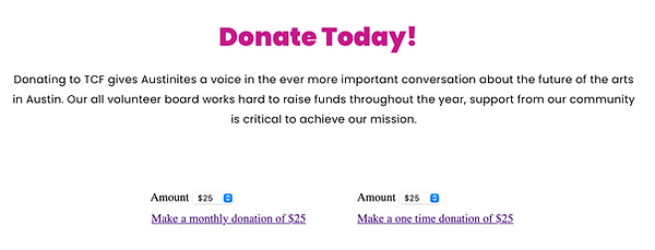
The form split one-time vs. monthly donations into two cluttered areas, hurting clarity and conversions.
🚫 Off-Brand & Distrustful
The Stripe widget didn’t match the visual brand or instill donor confidence. Some users even phoned board members to donate manually.
💸 No Budget for Dev Help
As a small nonprofit, The Creative Fund couldn’t afford a custom-coded donation tool.
🧩 Clunky UX = Lost Support
Dropdown menus, poorly spaced inputs, and vague CTAs created friction at the worst possible time: right before donation.
Board Member Sentiments
“We rely on donations, but the form made it hard for people to give.”
“It didn’t feel trustworthy—and we lost donors because of that.”
“People were reaching out just to ask how to donate. That shouldn’t happen.”
Redesign the Donation Experience Using AI—With No Dev Budget
The Creative Fund needed a fast, free, branded way to improve donations—especially recurring gifts. I offered to help redesign the experience using a blend of AI, no-code platforms, and smart UX thinking.
Primary Objectives
🔁 Unify one-time and monthly donation flows
💸 Increase total donations and recurring giving
🎨 Match the site’s brand for visual trust
🙅🏽♂️ Eliminate manual board processing
🤖 Leverage AI for a fast, dev-free solution
Success Criteria
✅ Higher donation completion rate
✅ Growth in monthly donors
✅ Positive user feedback on clarity and trust
✅ Full brand and site integration
✅ Fully implemented inside Wix with no breakage
From Clunky to Confident: Rebuilding with AI
By reverse-engineering the old Stripe widget and collaborating with Claude, I reimagined the entire donation flow—merging UX best practices with no-code implementation to deliver a branded, user-friendly, and high-converting experience.
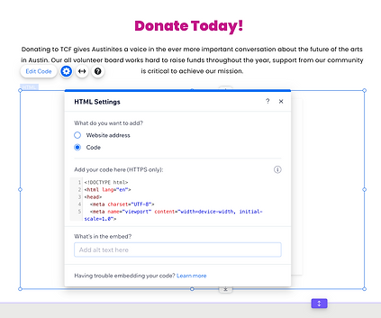
💻 Reverse-Engineered the Stripe Widget
I copied the existing code, loaded it into Claude, and asked for UX critiques and refactor suggestions. Within minutes, I had a simplified, combined version of the donation form—mobile-friendly and fully styled.
🤖 AI-Driven Iteration with Claude
I refined the code through multiple prompts:
Key Activities
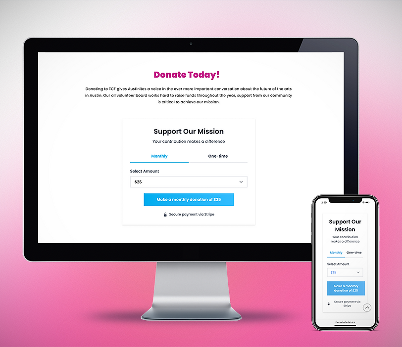
🔶 Merged monthly and one-time into a toggle
🔶 Replaced dropdowns with quick-select buttons
🔶 Added a secure payment lock icon + Stripe trust badge
🔶 Cleaned up layout and hierarchy

🎨 Branded the Experience
I updated the design to match The Creative Fund’s visual identity—applying their blue palette, Poppins typeface, and cleaner spacing to create a cohesive, trustworthy look that felt right at home on their site.
Key Activities
🔶 Swapped in The Creative Fund’s color palette (#00ADEF primary)
🔶 Updated fonts to Poppins for visual harmony
🔶 Tweaked spacing, shadows, and button widths for a clean, clickable layout

⚙️ Implemented via Wix
To bring the new donation experience to life in Wix, I focused on seamless integration, responsive design, and low-maintenance code that the team could easily manage moving forward.
Key Activities
🔶 Mapped user selections to dynamic button logic via JavaScript
🔶 Tested responsiveness across mobile and desktop
🔶 Configured the form to run seamlessly within Wix’s custom code panel
🔶 Shared preview with the board and applied final QA polish
Results That Fund the Mission
The redesigned donation flow didn’t just look better—it worked better. With clearer UX, brand alignment, and trust signals, The Creative Fund saw a major boost in giving and donor confidence within weeks of launch.
+45%
One-Time Donations
+30%
Monthly Donors
Immediate Impact
🙌 Manual No More
Board no longer handles donation processing
💬 User Praise
“Much easier” and “more trustworthy” feedback
⏱️ Fast Turnaround
Launched in under a week, no dev required
🧩 Seamless Fit
Fully branded and integrated into the Wix site
🤖 When AI Fills the Gaps
This wasn’t just a code tweak—it was a mission-critical upgrade for a nonprofit running on passion, not payroll. With no developers or budget in sight, I used AI as my design partner to rethink, rebuild, and relaunch their donation flow. In days, we transformed confusion into clarity—and gave donors (and the board) an experience they could trust.
💡 What I'd Do Differently Today
While the launch exceeded expectations and energized the board, I’ve since identified a few ways to make the experience even more sustainable and scalable. If I were leading this project again, I would:
🤖
Use Visual
Gen Tools
Incorporate tools like Midjourney to create custom, mission-aligned imagery—adding more heart and personality to the page.
💵
Enable Custom
Donation Amounts
Right now, users can only choose from preset options. That’s a Stripe limitation—but I’d love to help the team unlock this functionality in the future to meet donors where they are and maximize contributions.